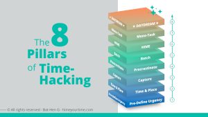
HIME Your TIME method builds on 8 principles that align into digital workflows, calendar included. Calendar should not be used solely for work events; it should provide bird’s-eye view on all responsibilities including personal events, tasks and 3rd party commitments, providing an impactful prioritization process along with lean execution of tasks.
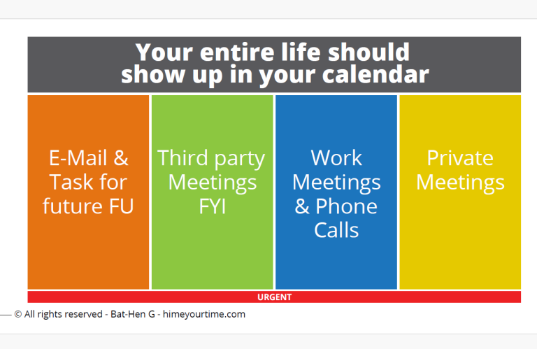
By managing all the chaos in one view, we gain clarity and, eventually, peace of mind.
We are no longer managed by our deadlines; instead, we can stay ahead of them.
We no longer have to put out last-minute “fires”—and ideally, we won’t have any “flames” to begin with. To manage all of this heavy lifting through the calendar, I recommend using only 5 colors, divide into the following strict categories:
1. Work meetings — BLUE
One color (in my case, BLUE) is designated for work meetings and Zoom calls in which your personal presence is required.
Note: If you work in a large organization and often join group meetings where you are not sure in advance whether you can attend, do not mark them with this color (keep reading).
Note 2: If you work at two companies or have a personal side project, use a shade of the same color (in my case, LIGHT BLUE) to mark all meetings related to your second project. It is very important that you use a shade of the same color—not a different color.
2. Personal meetings and events — YELLOW
One color (in my case, YELLOW) is designated for personal meetings and events that require your personal presence.
For example: grocery shopping, errands, the gym, parties, dinners, and personal phone calls all receive the same color. If you are not sure you can attend an event, do not mark it in this color (keep reading).
3. Tasks and follow-up emails — ORANGE
One color (in my case, ORANGE) is designated for tasks and follow-up emails that are not urgent and can be deferred, delayed, or postponed as needed.
Note: Emails can be turned into calendar events in both Gmail and Outlook, but my rule of thumb is that only emails that need to be followed up on later—within 10, 14, 30, 60 working days—should be moved to the calendar. Emails that need to be handled or followed up on within the next 7 working days should remain and treated in your inbox and not be moved to the calendar, that is designed to handle deferd not immidiate tasks.
This is highly important: many tasks and emails need to be deferred to a later time.
Your calendar should not carry all that “extra weight.” We want a lean, clear, and easy-to-use method—not a cluttered calendar view.
4. FYI — GREEN
One color (in my case, GREEN) is designated for FYI—For Your Information. This includes both professional and personal events where your presence is not required, but you should still know about them. They should appear in your calendar because you are either not sure whether you will attend, or because someone else’s event will affect the way you plan your week.
For example: your spouse or boss is flying abroad; your child has training but will be picked up by someone else; an employee is taking a holiday; there is a national holiday in your country; or you have been asked to join a group meeting but are not sure whether you can attend.
The older in age and busier you get, the more often this color will appear in your calendar, because it represents your limitations and the constraints around your time-management decisions. As a result, this color will have a growing impact on the way you plan and prioritize around it.
5. Urgent tasks — RED
RED is designated for urgent tasks—meaning emails or tasks that are time-sensitive and must be handled on a specific day or at a specific time, cannot be deferred, delayed, or postponed.
For example: flight tickets, concert tickets, urgent reminders, bills, or parking fines that will later incur interest or penalties.
Note: In the image below, RED is marked as a thin red line at the bottom because we rarely use it. Most of the tasks and emails we handle do not have a strict deadline, so please do not overuse this color in your calendar.
Make sure to first pre-define urgency with your team and managers to avoid having too many RED items in your calendar.
Read here to learn how: https://www.himeyourtime.com/create-a-buffer-have-a-life/
Last Pro Tip
Since we are all biased by time, I would estimate that at least 50% of the tasks we planned to finish this week will eventually not be completed. Therefore, every Sunday night or Monday morning, we should look back at last week’s calendar and move all the ORANGE tasks and follow-up emails that we left behind to a later time.
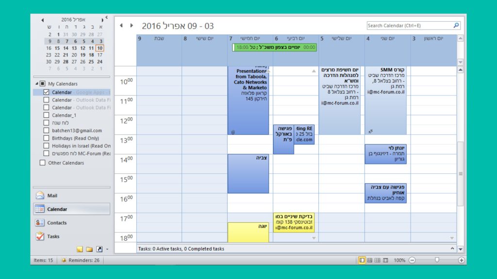
Any meetings that need to be rescheduled should also be moved from last week’s calendar to a new day and time. In other words, last week’s calendar should only show three color categories: work meetings, personal meetings, and FYIs that happened, occurred, or are done with.
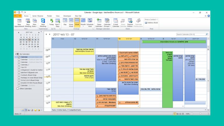
Current week calendar will include all 4 color categories
Last week’s calendar will show 3 color categories, all of events that are done and over with
To read more about this time bias that all humans experience, click: https://www.himeyourtime.com/keep-in-mind-the-human-time-bias-you-want-to-work-around/